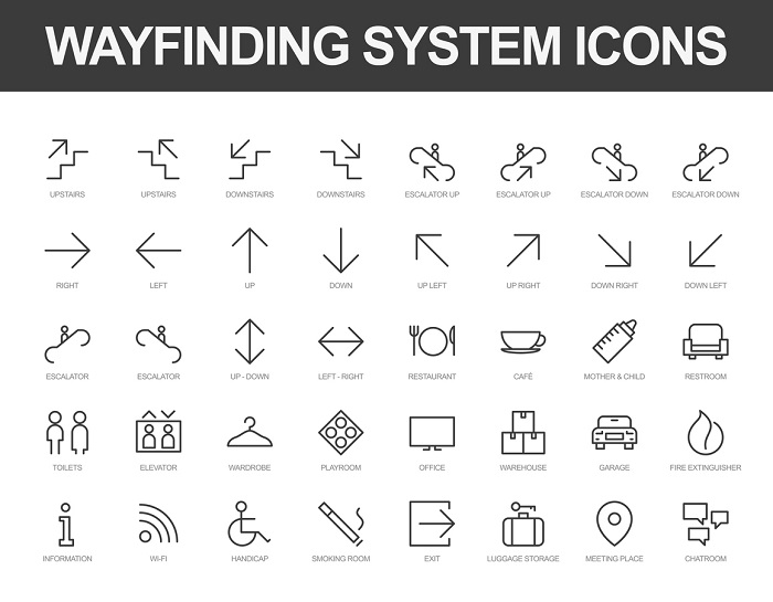
Wayfinding is a tool that helps people navigate between two or more points. What follows are the essential principles of wayfinding that will help increase understanding of the subject in order to create the best possible experience for all users.
What is wayfinding
Wayfinding is the act of finding your place from another location. Essentially, it is a long-form way of describing a system that is designed to assist someone with moving from one destination to another without getting lost. This is usually accomplished in modern times via digital services like Google Maps and Waze. But apps and software programs are simply a digital way to communicate information to users, as wayfinding itself is not inherently digital. Instead, it is simply a system that uses intelligent design to help the navigator get from point A to point B via landmarks, signage, colors, and other “analog” symbolism.

Why is wayfinding important?
Wayfinding is valuable because it allows individuals to more easily and efficiently navigate unfamiliar spaces, making return trips easier and more pleasant for customers or visitors. And at its best, wayfinding creates an excellent opportunity for companies to create more immersive branding experiences.
What are the principles of wayfinding?
The principles of wayfinding can be summed up in seven concepts:
- Identity
- Landmarks
- Paths
- Differing Regions
- Limiting Navigational Choices
- Signs at Decision points
- Sight Lines
1. Create a unique identity for each location
Principle: Each location should have an identifying characteristic that sets it apart from all others. This allows the visitor to easily identify the location and orient themselves based on visual information. This is the core principle of wayfinding -- allowing a visitor to recover and re-orientate themselves on a given identifying marker.
Design Application: An identity can be obtained through various methods, including color schemes, unique textures, text styles or fonts. It is important to note that while your identifying marker must be easily recognizable, it faces the dual challenge of needing to be as unobtrusive as possible within the larger context of the environment.
Example: Multiple buildings on the same street appear to be identical, but a given building has a unique red sign.
Additional Example: In a parking garage, every aisle is nearly identical, which can create confusion. However, if every section of the garage is numbered, and each number is assigned a unique color, it makes it easier for visitors to remember the location of their car and therefore find it more quickly upon return.
2. Use landmarks as visual cues
Principle: Landmarks also serve an important function in wayfinding. If a navigator knows a specific landmark in relation to their larger environment, then they know their position and can navigate where to go next. Landmarks’ most important attribute is their visibility; for instance, almost everyone who lives in Manhattan would know exactly where a given building was located if described in relation to Rockafeller Center.
Design Application: Landmarks help organize and define a specific area or space. But it is important to use them sparingly as too many landmarks can create clutter and make a location less unique or identifiable. Landmarks can also be man-made with signage stands that create a point of reference for visitors seeking information.
Example: Museums often have unique displays that serve as both an exhibit and a landmark for navigating their premises. The large T-rex skeleton at the Natural History Museum in New York provides a landmark for wayfinding in addition to being an impressive display.
3. Create well-structured paths
Principle: Paths should have a unique set of characteristics that set them apart. A well-structured path helps navigators to maintain their orientation, allowing them to move from landmark to landmark without getting lost.
Design Application: The beginning and end of the path should serve as the introduction to the route, with markers in between designating where to move next. This is exemplified by regularly-posted highway signs that display the distance to popular destinations so that the driver knows whether or not they are on the right path.
Example: Colleges and universities create destination signs so that students are always aware of where a specific building is, helping them to navigate the large campuses.
4. Create regions with unique visual character
Principle: To assist with wayfinding in a large area, the area should be subdivided into smaller, easier to map out regions. Each region should have a set of visual attributes that define and set it apart from the others. There is no specific requirement regarding a region’s overall size; what’s most important is that each is unique.
Design Application: With the regions divided, it is easy for someone to move from one space to another as needed. In an airport, for example, each unique region uses different identifying colors, indicating where check-in, security and boarding take place. This provides a useful function while helping the visitor navigate the larger airport environment.
Example: In a museum, each section of the museum is painted with different colors and fonts to indicate changes in the exhibit. This serves the dual function of conveying the spirit of the exhibit being displayed, while also providing a wayfinding function that visually communicates to the visitor that they are entering a different part of the museum.
5. Limit user choice
Principle: It is important to restrict the navigator’s wayfinding choices as much as possible by displaying only the most pertinent information. While there may be multiple ways to get from place to place, the space should be designed that only 1 or 2 routes are listed and defined. Limiting user choice prevents confusion and allows them to orient themselves to their surroundings faster.
Design Application: This principle is important if you want the navigator to experience something specific along your path. By eliminating the option for detours and keeping them on a primary defined path, they are able to establish an understanding of the space faster.
Example: Most museums’ wayfinding design has been developed in a way that allows visitors to view all exhibits in a specific order, as part of a complete path. If they weren’t, visitors would easily get lost and miss entire exhibits.
6. Provide signs at decision points
Principle: Decision points occur in areas where the navigator must decide to either continue on their route or change direction. Signs at decision points help to provide more detailed information regarding what lies ahead on either path, helping to establish their own place while furthering the goal of getting them to their final destination.
Design Application: A sign should have navigational information that is authoritative and unambiguous. If the consequence of making a wrong turn may be negative for the visitor or there is insufficient information available at the decision point, a sign is necessary.
Example: At airports, it’s critical that people are able to move quickly and easily around the facility as the consequence of getting lost is potentially missing a flight. This means multiple signs are necessary for helping people get to where they need to go while communicating to them that they are on the right path.
7. Use sightlines to show what's ahead
Principle: Sightlines are important for establishing initial interest or a sense of place. Sightlines are not always reliable, but they can provide a visual representation of what is ahead, then helping to guide the visitor in that direction if they so desire.
Design Application: This principle is a popular alternative to a physical sign. By providing points of interest within sight lines, designers can guide a visitor through a suggested path by simply placing interesting elements within their line of sight.
Example: Museum designers may place a dinosaur skeleton or other large exhibit in an area that is easy to view from multiple locations. That allows the visitor to make a judgment based on that visual which can then draw them to that display without the need for a sign or path.

