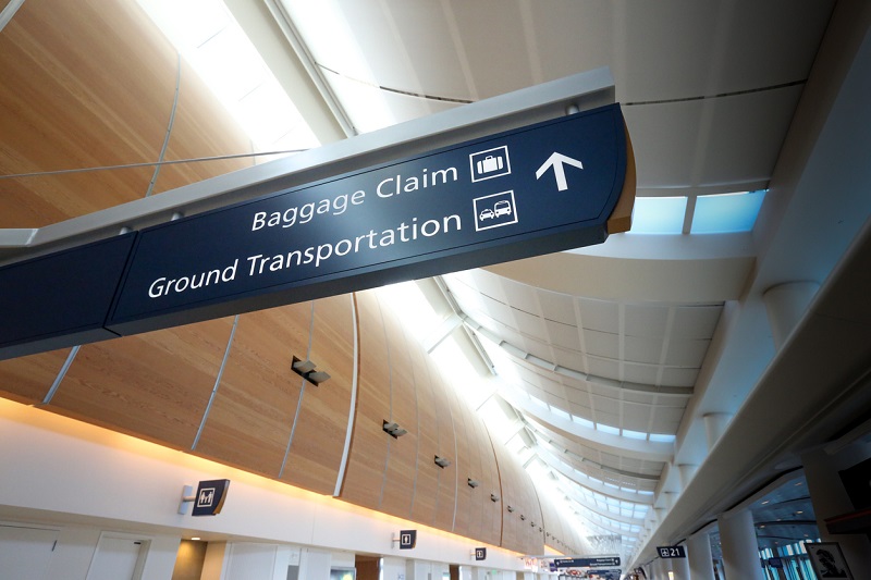
A wayfinding strategy is the plan behind a navigation system. It defines who needs to get where in a space, what information they need at each point along the way, and which tools—such as signs, maps, landmarks, lighting, or digital kiosks—will deliver that information. The rest of this page covers how to build one, what the finished document should include, and how to tell whether it's working.
What does a wayfinding strategy cover?
A complete wayfinding strategy answers four questions. Who is navigating the space, and what do they already know about it? Where are they trying to go, and from which starting points? What decisions do they face along each route? And what should guide them at each of those decision points?
The answers shape everything that follows, from where signs are placed to whether the environment needs physical signage, digital wayfinding kiosks, or both.
Why should you plan wayfinding before choosing signs?
Without a strategy, signage tends to fix isolated problems while the overall route stays confusing. A sign gets added wherever complaints pile up, tells people things they already know, and goes quiet at the intersections where visitors actually hesitate. Repeated questions to staff about the same destinations usually point to one of those gaps.
A strategy built on how real visitors move through the space puts clear guidance where decisions happen and keeps clutter out of the places where it would compete for attention. This matters most in high-stakes environments like hospitals, where wayfinding directly affects patient stress and missed appointments.
How do you develop a wayfinding strategy?
The process runs in five steps, and the order matters.
- Set priorities first. No wayfinding system accomplishes everything, so decide at the start which journeys matter most. A hospital might prioritize the route from parking to registration. A stadium prioritizes gates to seats to concessions. The priority journeys get the most design attention and the best placement.
- Study the people who will use it. Who visits, how often, what are they trying to do, and where do they currently get lost? First-time visitors need different support than daily regulars. Watch where people hesitate, turn around, or stop to ask staff for help, because those spots are the map of what the current environment fails to communicate.
- Map the environment and its decision points. Walk the routes a visitor walks. Note the natural paths, sightlines, and landmarks the architecture already provides, and mark every intersection, elevator bank, and lobby where a choice must be made. Accessibility belongs in this pass. Plan accessible routes and guidance for visitors with mobility or vision needs from the start.
- Choose the tools and test them. Signs, symbols, color coding, lighting, landmarks, and digital kiosks all carry wayfinding information, and they don't work equally well in every environment or with every audience. Test with real users where possible, because a route that looks obvious on a floor plan can fail in the actual space. Expect some trial and error.
- Document the strategy and assign ownership. Record the findings, the decisions, and the reasoning behind them. Name who updates directories, maps, destination names, and routes when something changes. Without a named owner, the information drifts out of date and the system quietly stops being trusted.
What should a wayfinding strategy document include?
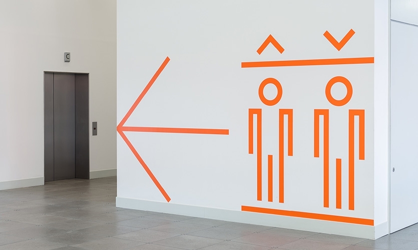
The finished document is the reference everyone builds from, and it should cover:
- The priority journeys and why they were chosen
- Destination naming conventions, so signs, maps, and directories all use the same names
- Route maps for the priority journeys
- Tool placement, which information appears at which decision points
- Accessibility requirements for each route
- Testing results and what changed because of them
- Who is responsible for updating directories, maps, destination names, and routes
How do you know whether your wayfinding strategy is working?
The same observation that built the strategy is what tests it. Watch whether visitors reach the priority destinations without stopping for help, where wrong turns happen, and whether direction requests to staff go down after a change. Compare before and after using similar visitor groups on similar journeys, since a weekday-regular crowd behaves differently than a first-time event crowd.
None of this needs special tooling. A few observation sessions and a simple count of staff direction requests, taken before a change and again after it settles, give a facility a real before-and-after picture of whether the strategy is doing its job.
How do the principles of wayfinding fit in?
The strategy decides what your space needs; wayfinding design principles are the vocabulary the plan draws on when it gets to layout and signage decisions. We cover them in depth in our guide to the seven principles of wayfinding, including how each one translates into digital systems.
When should wayfinding go digital?
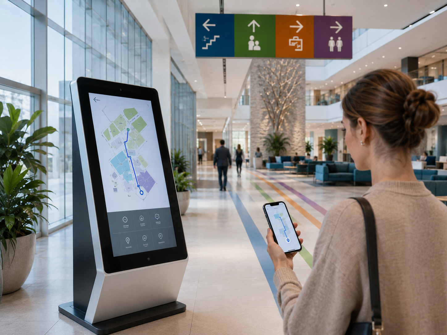 Digital wayfinding earns its place in environments where information changes. Three questions tell you whether that describes your facility. How often do directories, events, and tenant or department names change? Do visitors need searchable destinations, multiple languages, or directions they can take with them? And who will maintain the system? Digital content needs someone responsible for keeping it accurate, just as printed signage does, even when updates are faster.
Static wayfinding signage keeps its role, especially at decision points and where regulations require it. If accessibility needs include audio output or controls positioned within accessible reach, treat those as features to specify and verify during hardware and software selection rather than capabilities to assume. The digital wayfinding kiosk page covers the hardware and software options in detail.
A hybrid approach can combine digital kiosks at entrances and major decision points with consistent physical signage along the routes.
Wayfinding Strategy FAQ
Should wayfinding planning start outside the building?
Usually, yes. For most visitors the journey starts at a parking deck, a transit stop, or a drop-off point, and the first wrong turn often happens before the front door. A strategy that covers parking, arrival entrances, and the path to the first interior decision point catches problems an indoor-only plan misses.
How long does it take to develop a wayfinding strategy?
It depends on the size of the space, the number of priority journeys, and how much user observation the project includes. A single building with a few key routes moves faster than a multi-building campus. The observation phase is the part worth protecting, since everything else is built on it.
Can an existing facility add a wayfinding strategy, or is it only for new construction?
Both work. An existing facility starts by observing where current visitors struggle. New construction builds the strategy from floor plans and intended traffic flow, then verifies it with observation once the building opens.
Who should be involved in developing the strategy?
Facilities management, the people who answer visitor questions every day (front desk, security, volunteers), whoever is responsible for accessibility compliance, and a few representative visitors. Staff know where questions pile up; visitors reveal the problems staff have stopped noticing.
Does a wayfinding strategy require digital kiosks?
No. The strategy determines the tools, not the other way around. Many environments are served well by physical signage alone. Digital earns its place where information changes often, routes are complex, or accessibility needs go beyond what static signs provide.