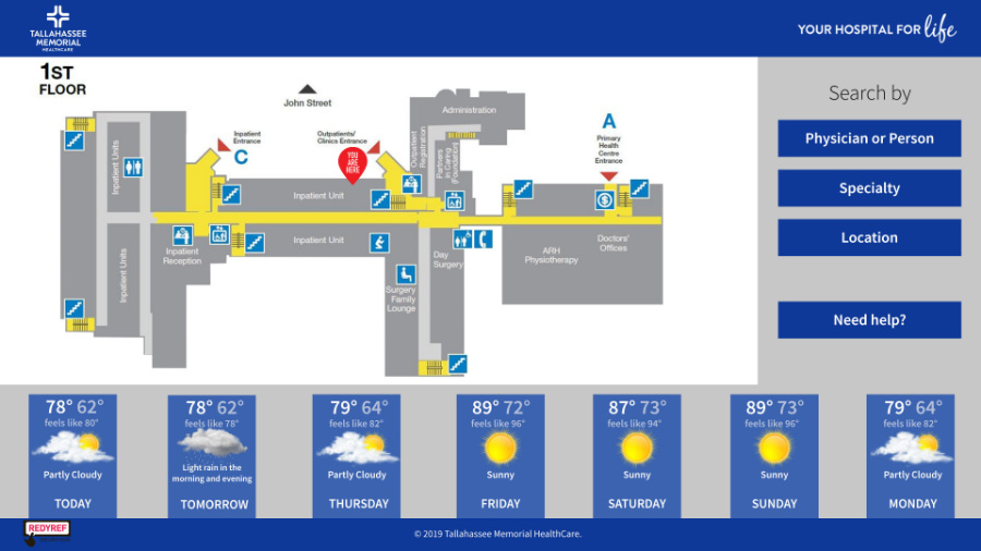
 Hospitals are confusing — especially large, multi-building campuses. You've probably felt it yourself: that sinking, lost-in-a-maze feeling when you or someone you love is already stressed about an appointment or a procedure. Effective wayfinding exists to fix exactly that.
Think of wayfinding as a hospital's built-in guide: a coordinated system of signage, color-coded pathways, interactive kiosks, and mobile tools that helps patients, visitors, and staff get where they need to go without asking, wandering, or worrying. Done well, nobody notices it. Done poorly, everyone does.
Why Wayfinding Matters in Hospitals
Hospitals are among the most difficult buildings in the world to navigate — decades of expansions, multiple towers, departments that moved three renovations ago. A well-designed wayfinding system pays for itself in three ways:
1. It reduces patient stress
No one wants to be in a hospital. Patients arrive anxious, and getting lost compounds that anxiety at exactly the wrong moment. Research on patient experience consistently ties navigation confusion to lower satisfaction scores — and intuitive wayfinding reverses it. When people know where they're going, they feel more in control, and a patient who arrives calm is a better start to every appointment.
2. It saves time — for everyone
Minutes matter in healthcare. Good wayfinding gets patients and visitors to their destinations faster, which means fewer missed appointment windows, fewer late arrivals rippling through the day's schedule, and less time spent wandering hallways that all look the same.
3. It frees your staff to do their actual jobs
Ask any hospital front-desk team how often they're stopped for directions: constantly. Every one of those interruptions is a small tax on patient care. Effective wayfinding empowers people to navigate independently, so nurses, technicians, and administrative staff spend their time on the work only they can do — not directing foot traffic.
In the Field: Tallahassee Memorial Healthcare
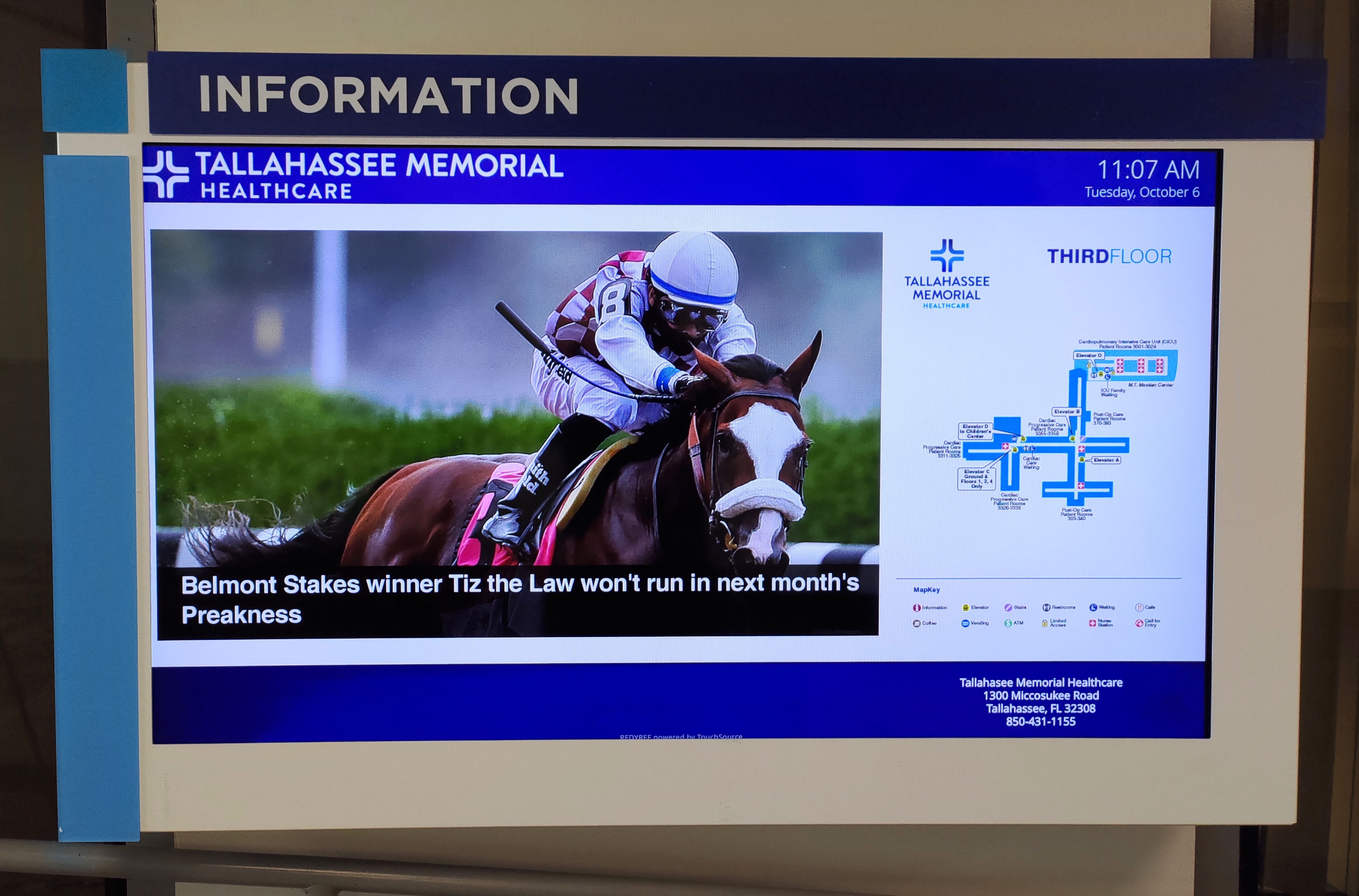 When Tallahassee Memorial Healthcare — a 772-bed acute care hospital serving 17 counties across the Florida panhandle and southern Georgia — set out to make its campus less stressful to navigate, REDYREF installed 13 digital wayfinding kiosks across the health system.
The kiosks pair interactive directories with dynamic, animated turn-by-turn navigation paths, so visitors don't just see where something is — they see how to get there. QR-code mobile handover lets directions travel with the patient on their own phone. And every kiosk is ADA-compliant, adjusting its interface to wheelchair-friendly height on demand. Beyond navigation, the units display building information, public health announcements, and full campus maps for every floor.
The result is the difference between a lobby full of lost visitors and a campus that guides people itself.
How to Improve Your Hospital's Wayfinding: 7 Practical Strategies
Most hospitals already have some wayfinding in place. But between growing patient populations, expanding facilities, and an aging visitor base, it's worth revisiting regularly. Here's where to focus:
1. Digital kiosks: interactive guides that scale
Interactive digital wayfinding kiosks are the single biggest upgrade over static directories. They provide searchable directories, detailed maps, and step-by-step directions — and because the software is cloud-managed, they stay accurate when departments move, staff changes, or construction reroutes a hallway. Many also surface hospital services, amenities, and visitor information, turning a directory into a front desk that never has a line.
2. Signage: the foundation everything else builds on
Clear, consistently placed signage remains essential — directional signs at every decision point, unambiguous labels for departments and wings, and digital signage displays in waiting areas that can update wait times and announcements in real time. The two rules: consistency and clarity. A beautiful sign system that changes vocabulary between floors is worse than a plain one that doesn't.
3. Thoughtful pathways and design
Color-coded pathways, distinct landmarks, and deliberate lighting help people orient themselves without reading a single word. Many hospitals successfully assign colors to wings or towers — "follow the blue line to Imaging" is an instruction anyone can execute while stressed, in any language, at any age.
4. Optimize sightlines
Often overlooked, always critical: can people actually see the next directional cue from where they're standing? When designing or renovating, walk the routes yourself. Visitors should be able to anticipate the next turn the way drivers anticipate the next road sign — if a sign only helps once you're lost, it's placed wrong.
5. Less is more: simplify the routes
It sounds counterintuitive, but limiting choices makes navigation easier. Instead of offering three routes to the same destination, define one clear, well-marked path. The goal isn't to showcase the building — it's to make the journey require as few decisions as possible.
6. Mobile wayfinding: directions that leave the lobby
Larger hospitals increasingly extend wayfinding to personal devices — whether through dedicated apps or, more simply, kiosk-to-phone handover like the QR-code approach used at Tallahassee Memorial. A visitor gets directions at the kiosk, scans a code, and the route travels with them. It's the same mobile handover model proven on large university campuses, applied to healthcare.
7. Accessibility isn't optional
Hospital wayfinding has to work for the people who need it most — patients in wheelchairs, visitors with low vision, aging family members, and non-English speakers. That means ADA-compliant kiosk mounting heights and reach ranges, screens that can lower on demand (as at TMH), high-contrast display modes and adjustable text sizes, and multilingual or audio-assisted options where your patient population needs them. Accessibility requirements aren't a compliance checkbox to clear at the end of a project — they're design inputs from day one, and the systems that treat them that way serve every visitor better.
Better Wayfinding Is a Better Patient Experience
Investing in clear wayfinding is investing in how people feel inside your facility. It reduces stress at the most stressful moments, protects staff time, keeps schedules moving, and signals to every patient and visitor that their time and comfort matter. The hospitals doing this best — from 772-bed regional systems to specialty clinics — treat wayfinding as infrastructure, not decoration.
If you're rethinking your hospital's navigation, start by watching how people currently move through your spaces: where they hesitate, where they ask for help, where they double back. Those friction points are your roadmap. Small changes make a measurable difference — and the right kiosk program can transform the whole experience.
Ready to see what digital wayfinding could look like in your facility? Explore REDYREF's wayfinding kiosks and software, or talk to our team about a deployment sized for your campus.