Interactive kiosks succeed or fail based on user experience (UX). If the interface feels intuitive, users move through it without hesitation; if it feels slow, confusing, or overly complicated, many will abandon the interaction before completing the task. For organizations deploying self-service kiosks, that means interface design cannot be treated as an afterthought. Decisions about navigation, content presentation, responsiveness, and accessibility all influence how people interact with the system in real operating environments.
What Makes Kiosks Interactive
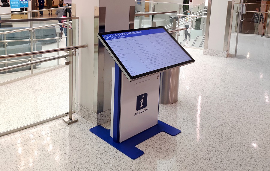
 The basic difference between digital signage and an interactive kiosk is straightforward: digital signage presents information, while interactive kiosks ask users to take action. Instead of simply viewing scheduled content, people can search, select, navigate, request information, or complete transactions directly through the interface. That shift from passive viewing to active participation is what gives kiosks their operational value.
This responsiveness allows kiosks to support functions static displays cannot handle, from wayfinding and directory services to ticketing and payment processing. Understanding how kiosks work at a technical level also helps clarify why certain interaction models perform better in specific environments. But adding interaction alone does not guarantee usability; a poorly designed kiosk with delayed response, unclear navigation, or inconsistent prompts can quickly frustrate users and undermine the intended benefit.
Touchscreen Technology and Interaction Models
Touchscreen interfaces have become the dominant interaction model for interactive kiosks because they feel familiar. Most users already understand touch interaction through smartphones and tablets, which reduces the learning curve in public environments. Even so, touchscreen technology is not interchangeable, and the sensing method behind the display affects how the kiosk performs under different operating conditions.
Capacitive vs. Resistive Touchscreens
Capacitive touchscreens detect changes in electrical fields when a conductive object, usually a finger, approaches the screen surface. This is the same technology used in smartphones, which is why capacitive displays typically feel smooth, responsive, and visually sharp. They also support multi-touch gestures and maintain strong optical clarity, making them the preferred choice for most indoor kiosk deployments where ease of use matters most.
The tradeoff is that capacitive screens do not respond well to gloves, non-conductive styluses, or other objects that lack conductivity. In healthcare settings, outdoor environments during colder months, or industrial applications where gloves are common, that limitation can become important.
Resistive touchscreens work differently by responding to physical pressure when two conductive layers make contact. Because they register pressure rather than conductivity, they can accept input from fingers, gloves, styluses, or rigid objects such as cards. That flexibility makes them useful in specialized environments, although they typically offer lower optical clarity, reduced sensitivity, and a less natural touch experience than capacitive alternatives.
Touch-Free Interaction Alternatives
Not every application benefits from direct screen contact. In some environments, touch-free interaction creates a better overall experience, particularly where shared surfaces are a concern or where mobile devices already play a role in the user journey. QR code workflows allow users to scan a displayed code and continue the interaction on their own phones, shifting control from a shared public screen to a personal device.
That model became far more common during COVID-19, but it continues to offer value in situations where users prefer personal-device control or where mobile functionality improves usability. Voice interaction is another option, especially when hands-free access improves accessibility, although voice interfaces perform best in quiet settings and often introduce challenges related to privacy, accent recognition, and background noise.
User Interface Design for Public-Facing Kiosks
 Designing for public kiosks is very different from designing for consumer software. Users often arrive with no training, limited patience, and varying levels of technical comfort, all while standing in public spaces where distractions are constant. In that context, even minor friction can lead someone to abandon the interaction entirely, which is why strong kiosk user experience depends more on clarity and predictability than on feature density.
Simplicity and Cognitive Load
Good kiosk interfaces reduce cognitive load by presenting only the information users need at a given moment. A wayfinding kiosk, for example, should help someone locate a destination quickly without exposing the complexity behind the mapping system itself. Visual hierarchy matters here: large buttons, clear labels, and generous spacing help guide attention while reducing accidental selections, especially when users are standing, distracted, or making quick decisions.
Language also plays an important role. Instructions should feel immediate and familiar rather than technical. A phrase such as "Select destination floor" works because it tells users exactly what to do without forcing them to interpret unfamiliar terminology.
Navigation Patterns and Task Flow
People approach kiosks with expectations shaped by other digital experiences, so navigation should feel recognizable immediately. For transactional applications like ticket purchasing, linear workflows usually work best because they guide users through selection, payment, and confirmation in a clear sequence.
More complex applications may require deeper menu structures or search functions, but users should always understand where they are within the process and how to return to the starting point. Consistent placement of home buttons, back controls, and help options helps build confidence, while progress indicators reduce abandonment by showing how much remains before completion.
Feedback and Error Prevention
Interactive systems need to confirm user actions immediately. When a button is pressed, people expect visual confirmation such as a highlight, color change, or animation within moments of contact. Even small delays create uncertainty and often lead to repeated taps or duplicate submissions.
Error messages should also help users recover quickly. Plain language such as "Please enter a valid email address" is far more effective than technical validation language because it tells users exactly what needs correction. In many cases, strong interface design prevents errors before they happen by limiting invalid inputs, selecting the right keyboard layout for each field, and providing examples where formatting matters.
Accessibility and Inclusive Design
Accessible kiosk design improves usability for people with disabilities while often making the system easier for everyone else to use. Clearer layouts, larger touch targets, better contrast, and stronger feedback mechanisms benefit all users, not only those relying on formal accessibility accommodations.
Physical Access and Reach Range
Kiosk height, screen angle, and component placement should support users with different mobility needs and physical reach ranges. Adjustable-height designs often provide the strongest accessibility because they allow screens, card readers, and printers to align more naturally with different users rather than forcing a single fixed position.
Visual Accessibility
Readable text, strong contrast, and thoughtful color choices become especially important in public environments where lighting conditions vary. Audio output and screen reader compatibility help users with severe vision impairments, although privacy remains an important consideration when sensitive information is involved. Headphone access or personal-device audio pairing can help balance accessibility with discretion.
Anti-glare coatings, recessed screen placement, and hooded enclosures also improve readability where reflections or direct light would otherwise interfere with visibility.
Motor Control Accommodations
Touch targets should be large enough to reduce accidental selections for users with limited fine motor control. Alternative input methods such as physical buttons, voice controls, or mobile-device handoff can also provide valuable flexibility when touch interaction alone is not ideal.
Content Management and Dynamic Updates
Interactive kiosk performance depends heavily on content staying current. Outdated schedules, incorrect pricing, or stale information quickly reduce trust, even when the hardware itself performs well.
Centralized Content Management
Cloud-based content management allows administrators to update one kiosk or an entire fleet remotely without requiring on-site visits. That makes scheduled changes far easier to manage, whether updating menus, promotions, operating hours, or facility information across multiple locations.
Performance and Responsiveness
Even strong interface design breaks down if the system feels slow. Large media files, inefficient code, or poor caching strategies can introduce lag that users immediately interpret as malfunction. Optimized content delivery and local caching help maintain fast response times even when connectivity fluctuates.
Analytics for User Experience Optimization
One of the biggest advantages of interactive kiosks is that they can reveal how people actually use them. Session tracking shows where users hesitate, which paths they follow, and where tasks are abandoned, while completion rates and error patterns often reveal usability issues that are not obvious during initial deployment.
This kind of data makes refinement more practical because design decisions can respond to observed behavior rather than assumptions.
Reliability and User Trust
Kiosk software plays a major role in whether users trust the experience. Fast response times, stable uptime, and graceful handling of interruptions all shape whether people feel confident using self-service systems. Hybrid architectures that combine local functionality with cloud-based updates help maintain reliability even when network conditions change.
Security protections matter just as much, especially when transactions or personal data are involved. Users should feel that the system is secure without needing to think about the mechanisms protecting it.
REDYREF Interactive Kiosk Solutions
REDYREF designs interactive kiosk systems around the way people actually use them. That includes touchscreen selection, interface planning, accessibility requirements, content management, and the performance considerations that affect task completion and user confidence.
From early user experience planning through deployment and ongoing refinement, our team evaluates how hardware, software, and interface design work together in real operating environments. Contact REDYREF to discuss interactive kiosk requirements for your application and user population.