Let's be honest: we've all experienced the frustration of getting lost in a new environment. Whether it's a sprawling hospital, a confusing university campus, or a massive shopping mall, navigating unfamiliar spaces can be a real headache. Traditional wayfinding signage, while helpful to an extent, often falls short. That's where digital wayfinding kiosks and interactive technology come into play.
At REDYREF, we're passionate about creating innovative kiosk solutions that transform the way people interact with their surroundings. In this post, we'll explore how interactive wayfinding is replacing outdated static signage and why it's a smart investment for organizations of all types.

Why Digital Wayfinding is the Future
While traditional signs have their place, they simply can't compete with the dynamic capabilities of digital wayfinding. Here's why interactive kiosks are the superior choice:
- Real-Time Updates: Forget about outdated information or confusing temporary signs. Digital kiosks can be updated instantly with schedule changes, room closures, emergency alerts, or any other critical information.
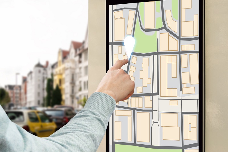
- Interactive Exploration: Users can actively search for specific destinations, explore different routes, and filter information based on their individual needs (e.g., accessible routes, specific departments, amenities).
- Personalized Guidance: Digital wayfinding systems can generate customized routes based on the user's starting point and desired destination, taking into account factors like walking speed, mobility limitations, and preferred modes of transportation within the facility.
- Multilingual Capabilities: With a simple tap, users can switch between languages, making your facility more welcoming and accessible to a global audience.
- Engaging Content: Beyond directions, kiosks can display engaging content like videos, promotions, event listings, and even interactive games, enhancing the overall visitor experience.
- Data-Driven Insights: Digital wayfinding systems collect valuable data on user interactions, popular destinations, and traffic patterns. This information can help you optimize facility layout, improve signage placement, and make data-backed decisions to enhance efficiency.
How Digital Wayfinding Kiosks Enhance the Visitor Experience
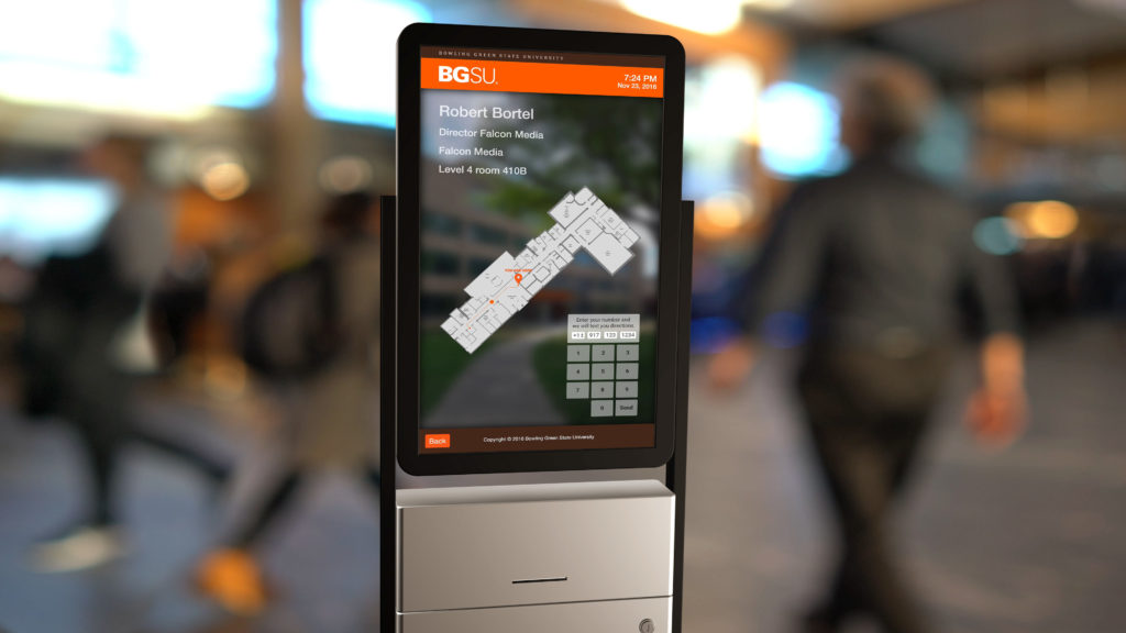
Imagine this: A new patient arrives at a large hospital, feeling anxious and overwhelmed. Instead of wandering aimlessly, they approach a sleek, user-friendly digital wayfinding kiosk. With a few taps on the touchscreen, they:
- Select their destination (e.g., Dr. Smith's office in Cardiology).
- Choose their preferred language.
- View a clear, customized route on an interactive map, with step-by-step directions.
- Optionally, they can even print the directions or send them to their smartphone.
This is the power of digital wayfinding in action. It transforms a potentially stressful experience into a smooth, efficient, and even enjoyable one.

Types of Wayfinding Signage -- and Where Digital Shines
Traditional wayfinding signage is categorized into four main types:
- Identification: Examples include door plaques, department markers, and historical markers. Digital Advantage: Kiosks can dynamically display this information, making updates and changes much easier. They can also incorporate interactive elements like staff directories or historical information.
- Regulatory: Think speed limit signs, "Employees Only" signs, or safety warnings. Digital Advantage: Digital signage can reinforce these rules more effectively with eye-catching visuals and animations. They can also be instantly updated to reflect changing regulations or temporary hazards.
- Directional: These signs guide people from point A to point B, like highway exit signs or directional arrows within a building. Digital Advantage: This is where digital wayfinding truly excels. Interactive maps, personalized routes, and real-time updates make navigation significantly easier.
- Informational: These signs provide general information about a location, such as operating hours, amenities, or directory services. Digital Advantage: Kiosks can offer a wealth of information in a user-friendly format, including interactive directories, FAQs, and even virtual tours.
REDYREF: Your Partner in Digital Wayfinding Solutions
At REDYREF, we're not just another kiosk manufacturer. We're experts in creating tailored digital wayfinding solutions that meet the unique needs of our clients. We have years of experience in designing, building, and implementing interactive kiosks for a wide range of industries, including:
- Healthcare: Helping patients and visitors navigate complex medical facilities with ease.
- Education: Guiding students, faculty, and visitors around campuses and within buildings.
- Corporate: Streamlining navigation in large office complexes and enhancing the employee and visitor experience.
- Retail: Assisting shoppers in finding stores, products, and services in malls and shopping centers.
- Transportation: Providing real-time information and directions in airports, train stations, and other transit hubs.

Our Approach to Digital Wayfinding
We believe that successful digital wayfinding goes beyond simply installing hardware. It requires a holistic approach that considers:
- User Research: Understanding your target audience and their specific needs is paramount.
- Strategic Planning: Developing a comprehensive wayfinding strategy that aligns with your organizational goals.
- Intuitive Design: Creating user-friendly interfaces and engaging content that is easy to understand and navigate.
- Seamless Integration: Connecting your wayfinding system with other building systems for a cohesive experience.
- Ongoing Support: Providing reliable maintenance, software updates, and technical assistance.
The REDYREF Difference
When you choose REDYREF, you're choosing a partner with a proven track record of success. Our digital wayfinding kiosks are:
- Customizable: Tailored to your specific needs, branding, and environment.
- Durable: Built with high-quality materials to withstand heavy use and diverse conditions.
- User-Friendly: Designed with intuitive touchscreens and clear, concise instructions.
- Secure: Equipped with robust security features to protect sensitive data.
- Scalable: Able to grow and adapt as your organization evolves.
Ready to Transform Your Wayfinding?
If you're ready to move beyond static signage and embrace the power of digital wayfinding, we're here to help. Contact us today to schedule a consultation. Let's discuss your unique challenges and explore how our innovative kiosk solutions can create a more efficient, engaging, and user-friendly environment for your visitors and staff. We're confident that we can help you achieve your wayfinding goals and enhance your organization's overall success.


